Thursday, December 20, 2018
Scheduling Interviews
I chose Evita Wallenda to talk about clear skin because she herself has clear skin, and I personally use her tips and tricks which has helped me have better, clearer skin. I am personally friends with her, so I managed to find a time to be at her house and ask her questions and show me what she uses and how. I asked her questions such as what her routine was, what products she used and why, how much they all cost, and how many times to do it daily. For the second part of the article, I wrote a "On the Cheaper Side" for those who may not want to spend a lot of money on the products, and things that can be used in replacement that you may even find at home. For that part, I asked her what she uses when she runs out of these products, or if she does not have them on her.

Scouting Locations


I previously took these photos of my model Adia Carroll at different locations in Sarasota, Florida. I chose these because when researching magazines, I noticed that many included the same look as these photos. In many of the fashion magazines I looked at, the clothing being worn is similar to Adia's.

I took this photo of Evita Wallenda at her house in Sarasota, Florida. I chose the position and styling to emphasize her clear skin.

I took this photo of the products being talked about in the article over some blankets for background color so that the reader knows what the products look like.
Table of Contents

For the table of contents, I chose this colorful photo because it matches the cover, and the picture let alone appears to be like a model photo. I chose the title "La Moda Contents" because many fashion magazines simply just restate the title of their magazine and add "contents". I kept the same fonts for the title as it is on the cover, but put contents underneath and edited it to curve/wrap around the title. I put the page numbers in white boxes so that they will stand out, and placed the titles of the articles next to them. I used black for the colors of my words so that everything matches, but used white for the boxes for contrast.
Mid Term Submission


When making adjustments and changes to my cover template, I decided to slightly move the headings and the title to fit the photo better. I looked at other fashion magazines who had their headings in similar placements, therefore helping me decide where I wanted mine.
When creating my table of contents, I wanted the model on the cover to be the table of contents as well. Only a few magazines did this or something similar, but I wanted my magazine to be a bit different. I used a colorful photo for the table of contents to create somewhat of a contrast between the cover. In many magazines I looked at, I noticed that they formatted it similar, with boxes with the page numbers and titles. The placement I chose was because of the photo, and I placed them in order going downwards around the model (Adia) so it is still legible.
For the first page of my article, I made the title a darker pink of her name to somewhat match/contrast the photo of the model (Evita). I made it larger than the rest of the title of the article to emphasize who is speaking and attract attention. The rest of the title is smaller and white to match the pink, to be read after attention is brought to her name. This was common in many fashion magazines. I chose to put a border around the photo of Evita to make it appear as more of a magazine article, since I had noticed without it it looked too plain. I chose a light pink for the color background to match the photo of Evita, and create a girly feel.
For the second page of my article, I decided to do something like a split article with cheaper options of the products talked about in the first part of the article. The picture on the page is addressed to the first part, showing the products she uses being recommended. It has a border around it as well to appear more like a magazine, as explained when talking about the first page. The background is a light pink to match the first page of the article.
Thursday, December 13, 2018
Cover Photo Decision


These are two photos I took in Sarasota, Florida a couple months ago with my friend. The model in the photo (my friend) and I decided to arrange a photo shoot for fun. The photos I took of her turned out much better than expected. I chose the first photo for my magazine cover because to me, it appears as if it would appear on an actual fashion magazine publication. Her outfit is in style, and represents modern fashionable attire.
Flat Plan

I chose to put my Ads in their placements because most fashion magazines I looked at had Ads in similar areas throughout my magazine. I chose these titles because I believe they would interest the reader, and they are similar to most fashion magazine titles. Overall, I believe this is very similar in comparison to actual fashion magazines.
Tuesday, December 4, 2018
Cover Template

The reason I chose my title to be "La Moda" is because my magazine is going to be about style, fashion, etc., and "La Moda" is "The Fashion" in Spanish. I chose this font because I felt as if it created structure and appears as if it would be used in an actual magazine. Along with the font, I chose black for the subheadings to match the title of the magazine and attract attention, and an outlined white for what the article will be about. I chose the placement of my subheadings to be where they are placed because I have pre-planned a photoshoot and arranged the subheadings to show the main focus of the photo to be visible.
Monday, November 19, 2018
Tiger Beat- Magazine Project Genre Research
Tiger Beat's cover is was mainly always celebrities and stories about them and their personal lives. There are more headlines featured of other celebrity stories as well.
The colors and text features that are utilized are always very colorful, bright, and pop out.
The types of articles included in Tiger Beat are basically updates of celebrities' lives, as well as popular gossip about them.
There aren't advertisements in Tiger Beat, considering it is just a magazine about celebrity life.
The types of photos that appear on the cover can be assumed to be taken by paparazzi or from a modeling photo shoot. They liked using heartthrobs or idols that younger kids were intrigued with.
The types of photos that appear on the cover, table of contents, and articles are of celebrities as well.
Since Tiger Beat is no longer an active magazine, there is no longer a distribution number, although, they had a large audience made up of younger girls.
Tiger Beat does not have any known public award listings or nominations.
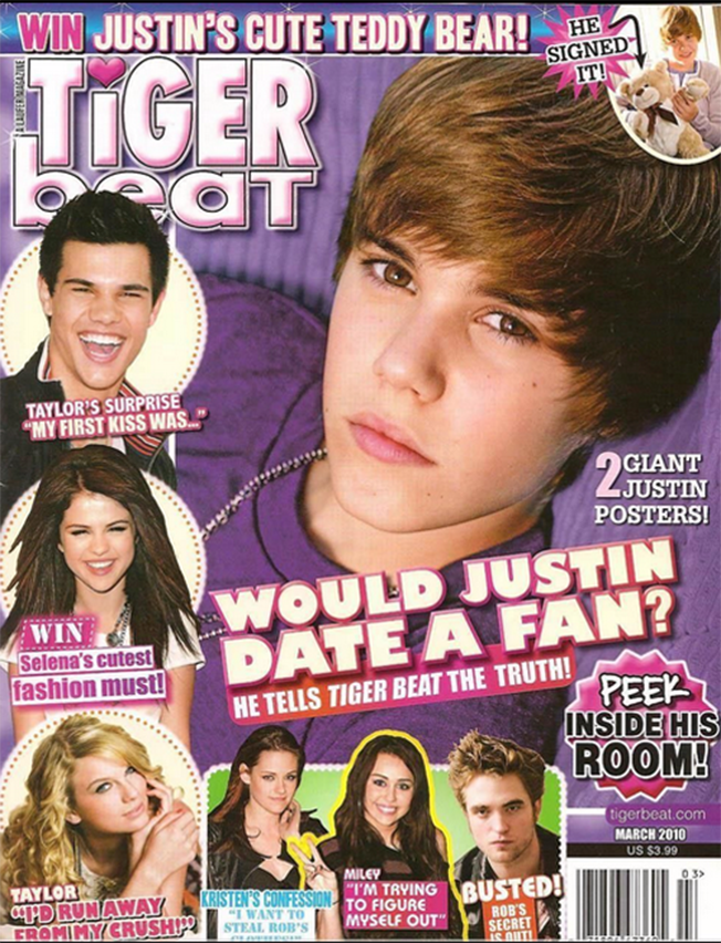
The colors and text features that are utilized are always very colorful, bright, and pop out.
The types of articles included in Tiger Beat are basically updates of celebrities' lives, as well as popular gossip about them.
There aren't advertisements in Tiger Beat, considering it is just a magazine about celebrity life.
The types of photos that appear on the cover can be assumed to be taken by paparazzi or from a modeling photo shoot. They liked using heartthrobs or idols that younger kids were intrigued with.
The types of photos that appear on the cover, table of contents, and articles are of celebrities as well.
Since Tiger Beat is no longer an active magazine, there is no longer a distribution number, although, they had a large audience made up of younger girls.
Tiger Beat does not have any known public award listings or nominations.
Elle Girl- Magazine Project Genre Research
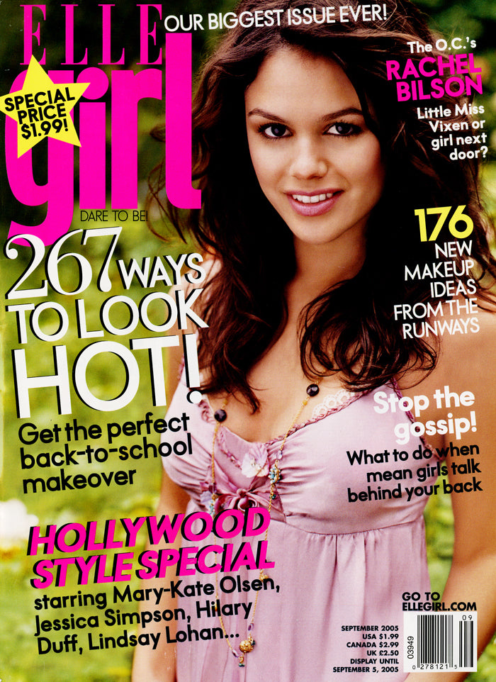
Elle Girl's cover layout always has a female model (considering their desired audience is younger females), typically a celebrity, along with that celebrities headline and many other headlines that are featured throughout the magazine.
The colors and text features that are utilized are usually similar. The colorful texts, and large detailed fonts. It helps give a younger girl-like feel to the magazine.
The types of articles featured in Elle Girl are focused on topics that would attract a young female's attention, such as shopping booklets, makeup tutorials, celebrity interviews, etc.
The types of advertisements included are about products that appeal to that same group, celebrity products who are featured in the magazine, etc.
The types of photos that appear on the cover, table of contents, and articles are in association with the main topics being talked about, or to describe and go into more detail about a specific article.
The distribution number for Elle Girl is 69 million readers worldwide.
Elle Girl was a nominee for the Annual Canadian National Magazine Awards Nominees.
Wednesday, November 14, 2018
Girl's Life- Magazine Project Genre Research
The cover of Girl's Life is usually very vibrant and uses many different colors, assuming for a young-looking effect. They use a lot of pink, blue, yellow, and red for definition. Along with colors, the fonts are very bold and visible.
The articles included are of topics that typically appeal to young girls/teens. For example, fun quizzes, exclusives with celebrities, strategies to dealing with stress, etc. Celebrity articles will usually take up more than one page and include a photo of them and a longer interview. Shorter articles may be together on singular pages because there is not much to talk about on the topic.
This magazine is known for being ad-free, therefore has no advertisements.
The photos that appear on the cover, table of contents, and articles are of younger female models or celebrities in fashionable clothing or makeup.
The distribution number for the magazine is 2.16 million tween and teen girls.
Girl's Life has been awarded the Parent's Guide to Children's Media Award multiple times, and the Gold Awards.

The articles included are of topics that typically appeal to young girls/teens. For example, fun quizzes, exclusives with celebrities, strategies to dealing with stress, etc. Celebrity articles will usually take up more than one page and include a photo of them and a longer interview. Shorter articles may be together on singular pages because there is not much to talk about on the topic.
The photos that appear on the cover, table of contents, and articles are of younger female models or celebrities in fashionable clothing or makeup.
The distribution number for the magazine is 2.16 million tween and teen girls.
Girl's Life has been awarded the Parent's Guide to Children's Media Award multiple times, and the Gold Awards.
Teen Vogue- Magazine Project Genre Research
Teen Vogue covers typically have a celebrity model with an article heading to their article, fashion styles, hair and makeup, and season styles.
They use fairly neutral colors in their covers and inside pages. It is a more laid-back teenage/young-adult magazine. Though some bright colors are used in words, the fonts typically remain standard and exemplary.
The types of articles included in Teen Vogue are about celebrities, beauty, style, etc. Celebrity articles typically take up two pages and are much longer. Beauty and style articles are much shorter and straight to the main idea.
The photos that appear on the cover are typically of celebrity models known for their style, and cosmetic appeals, as well with the table of contents and articles, although, the articles will include more of a variety of photos such as items and products.
The distribution number for Teen Vogue is approximately one million people, directed towards teenagers and or young adults, but a majority of their audience is teenage girls.
Teen Vogue has been awarded the GLAAD Media Award for Outstanding Magazine Overall Coverage.

They use fairly neutral colors in their covers and inside pages. It is a more laid-back teenage/young-adult magazine. Though some bright colors are used in words, the fonts typically remain standard and exemplary.
The types of articles included in Teen Vogue are about celebrities, beauty, style, etc. Celebrity articles typically take up two pages and are much longer. Beauty and style articles are much shorter and straight to the main idea.
The photos that appear on the cover are typically of celebrity models known for their style, and cosmetic appeals, as well with the table of contents and articles, although, the articles will include more of a variety of photos such as items and products.
The distribution number for Teen Vogue is approximately one million people, directed towards teenagers and or young adults, but a majority of their audience is teenage girls.
Teen Vogue has been awarded the GLAAD Media Award for Outstanding Magazine Overall Coverage.
Monday, November 12, 2018
Seventeen Magazine- Magazine Project Genre Research

Seventeen Magazine's cover layout is very colorful and the font used is typically youthful-looking. For example, bubbly letters and or colorful letters. They include captions and phrases that would appeal to the young mind- since it is a teen magazine- such as "Shake it Up!" or "Cool Girl Vibes".
A generalization of the type of articles included in the magazine are about cosmetics, younger celebrity interviews, clothing styles, food, and room decor.
Advertisements such as Covergirl, Olay, and other cosmetic companies are widely displayed throughout the magazine. Not only these ads, but fashion ads are displayed as well.
Many vibrant photos that capture younger attributes are on nearly every page. The photos are usually of teenagers or young adults (some celebrities) in stylish clothing or advertise a product directed towards the teenage crowd.
The table of contents in Seventeen Magazine typically includes features, columns, and departments of fashion, beauty, celebrities, etc.
The articles that appear on the cover are usually in season, popular to the month or time, or uprising topics in the media that would interest a young audience- typically females.
Seventeen has won the Besties Awards and the Social Media Award, as well as been a nominee for multiple publication awards.
Monday, November 5, 2018
Project Selection- My Decision
I have chosen the magazine project. I feel as if I will be able to manage my time better with a magazine instead of a film because of the different types of work that need to be put in. As well, I enjoy taking pictures and writing rather than shooting videos and directing people around. It is more of an independent project, and I work better alone rather than in a group because I don't know how much effort others will put in to make a film presentable. I possess skills such as organization, time management, and photography which will help me in creating the magazine project.
The magazine project I am doing will consist of multiple interviews and photos to express the person's interests that I am interviewing. I am interested in doing a fashion related magazine with clothing styles and cosmetics. I do not like working in groups, so I will be working alone with my own ideas and layouts. I will need to put a lot of outside school work into this project to creating an eye-catching and intriguing magazine to achieve a good grade.
The magazine project I am doing will consist of multiple interviews and photos to express the person's interests that I am interviewing. I am interested in doing a fashion related magazine with clothing styles and cosmetics. I do not like working in groups, so I will be working alone with my own ideas and layouts. I will need to put a lot of outside school work into this project to creating an eye-catching and intriguing magazine to achieve a good grade.
Thursday, November 1, 2018
Project Selection- Film
Some aspects of film production that interest me based on what I have learned in class are directing, shooting scenes, casting actors, and costume design. Directing and shooting scenes can be fun, especially if you are a perfectionist and want the film to appear well. Finding a setting or ambiance to fit the scene can be exciting because of all the options. Costume design appeals to me because dressing people to fit their character can be enjoyable and or fun. I possess skills such as time management, and organization which greatly helps in creating a film. Time management is a necessity in film making because without it it would take far too long to finish. Organization is a necessity as well when cutting scenes and placing them in a correct order to make sense of the film. Although, some things may make the project a challenge for me such as lack of others' cooperation and settings, and difficulty creating a script.
Wednesday, October 31, 2018
Project Selection- Magazine
Based on my experiences and what I have learned in class, I am interested in interviews, and taking photos. Interviews is an interest I have because I find what people have to say about themselves interesting- and readers would enjoy it as well. I would choose people that interest me or have a unique characteristic that is worth the interview. Taking photos interests me because captivating a person is very intriguing and can show a vast amount of emotion, style, and many other things depending on the genre. Photos help express ideas and or possibly share information. I possess skills such as time management, organization, communication, and writing which would greatly help me in making a magazine project. Without these skills, it would be extremely difficult to achieve success in creating a magazine. The project may become a challenge if there is procrastination, which would cause me stress and ease, possibly delaying the process of creating the magazine. As well, not having people to be interviewed or objects of photos to be taken, it would become be hard as well.
Subscribe to:
Posts (Atom)